Massachusetts’ largest public school system opened a new front in a long running cartographical battle by switching from one commonly-used world map to another that better reflects the relative sizes of Earth’s continents. What the newly adopted world map gains in comparative land-area accuracy, however, it sacrifices in the realism of the shapes used to depict terra firma.
The Mercator projection is being replaced in Boston’s public school system despite its longstanding use and popularity (Wikimedia Commons).
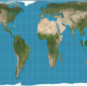
Earlier this year, Boston’s 57,000-student school system reportedly opted to jettison the Mercator projection (at right), which dates back to the 16th century, in favor of the more recent Gall-Peters projection (above) in an effort to “decolonize” the curriculum. The move is part of a larger trend in recent decades that has seen some educators calling for a less-Eurocentric focus on academics in American schools. Compared to the Mercator map that most Americans are accustomed to seeing on classroom walls, the Gall-Peters map gives more prominence to South America, Africa, and Australia, while de-emphasizing North America, Europe, Greenland and Northern Asia.
The difficulty for cartographers, or mapmakers, is that it is geometrically impossible to project a visual representation of the Earth’s surface—which is nearly spherical, technically an ellipsoid—onto a two-dimensional flat surface with perfect accuracy. Any “projection” or map arrangement devised by the experts necessarily results in some distortion either to the shape, size, or relative positioning of Earth’s landmasses.
The Mercator projection, first developed by a Flemish mapmaker named Gerardus Mercator, was developed during the age of exploration, at a time when maps were mostly used for navigational purposes. The Mercator map therefore perfectly captures continental shapes, which would be most important for mariners seeking to find quick and accurate sea routes. Because of distortions at the poles, however, this configuration makes areas like Greenland or Antarctica appear much larger than they actually are. (Greenland for example appears as large as South America when it is really only a fraction of the size). This map became the conventional depiction of the globe, particularly in the West.
The Gall-Peters projection, which was developed independently by two separate cartographers, one during the 19th century the other during the 20th century, arranges lines of latitude and longitude in a nearly perfect grid. This allowed the cartographers to accurately preserve the relative sizes of continents, but distorts their shapes, making landmasses near the equator seem taller and narrower, while making continents at the poles appear flatter and shorter.
In an article that appeared in the Guardian, a Boston Public Schools official, who defended the decision to adopt the Gall-Peters projection, which was made internally by the district, said the switch was done as part of a larger effort to “decolonize” the curriculum. The argument being that the minimization of areas with more third-world nations under the Mercator map is emblematic of a marginalization of those societies that should be corrected in a more globally oriented curriculum. The Atlantic ran a story that employs similar logic, titled “Boston Puts a Better Map in the Classroom.”
Not all cartography-watchers agree with this assessment, however. Nick Danforth, a PhD in American History who is now a senior policy analyst at the Bipartisan Policy Center, disputed the assertion that the Mercator map reflects a colonial mentality in 2015. His argument, in essence, is that a truly colonial map would maximize, rather than minimize the size of continents like Africa, South America, and Australia which were, at the time, subjects of a massive geo-political power struggle in which European powers raced to capture as much new territory as possible. He argues that critics are making too much of the significance of the size of areas like Antarctica and Greenland, which no one confuses for cultural or political power-centers.
The Winkel tripel projection is a world map style favored by many cartographers for the balance it strikes between the accuracy of the relative size and shape of the continents (Wikimedia Commons).
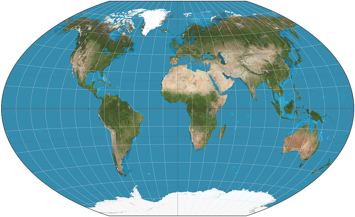
Interestingly, the Boston Public Schools officials behind the world map change opted to forgo some of the compromise projections that have been adopted by some leading organizations like National Geographic. That organization, for example, uses the Winkel tripel projection (at right), which rounds the edges of the world map—and while not perfectly accurate in terms of sizes or shapes—is favored by many as a particularly elegant solution to the problem.
The debate has also made its inroads into popular culture. Many watchers of the television show the West Wing may remember an episode in which the Mercator versus Gall-Peters controversy was first playfully introduced to mainstream audiences.